

Verwandeln Sie Ihre Kunstwerke in fesselnde Meisterwerke, indem Sie die Kunst der Bildkomposition meistern. Die Bedeutung der Bildkomposition kann nicht hoch genug eingeschätzt werden. Um Ihre visuellen Kommunikationsfähigkeiten zu verbessern, ist das Verständnis der grundlegenden Prinzipien der Bildkomposition der Schlüssel. Von der Drittelregel bis hin zu Führungslinien – begeben Sie sich auf eine transformative Entdeckungsreise durch die Welt der Bildkomposition.
Die Macht der Kontemplation
Im Kontext der Bildkomposition bezeichnet Kontemplation das bewusste Innehalten und Nachdenken über die Szene oder das Motiv vor dem Fotografieren. Dabei nimmt man sich einen Moment Zeit, um die Kompositionselemente wie Bildausschnitt, Licht und Perspektive zu betrachten. Kontemplation ermöglicht es dem Künstler, eine tiefere Verbindung zum Motiv herzustellen, wodurch Bilder entstehen, die eine reichhaltigere Geschichte erzählen und stärkere Emotionen hervorrufen.

Ich halte die Fähigkeit zur Selbstbeobachtung und Reflexion für wichtiger denn je. Unser Alltag ist oft von schnelllebigen Eindrücken geprägt, die jedoch kaum einen bleibenden Eindruck in unserem Inneren hinterlassen. Im digitalen Zeitalter steht die Kunst der Kontemplation vor neuen Herausforderungen. Das rasante Informationstempo und der Wunsch nach sofortigem Teilen verleiten uns oft dazu, Fotos zu machen und zu teilen, ohne uns die nötige Zeit für die besinnliche Reflexion zu nehmen. Der ständige Bilderstrom in sozialen Medien kann zu einer Kultur beitragen, in der Quantität manchmal wichtiger ist als Qualität.
Zusammenfassend lässt sich sagen, dass die Reflexion im digitalen Zeitalter unerlässlich ist, da sie es uns ermöglicht, die Hektik der Momentaufnahmen zu überwinden und unseren Kompositionen bewusst Tiefe zu verleihen, um so überzeugende visuelle Geschichten zu erzählen.
Die Fähigkeit zur Beobachtung

Die Fähigkeit, künstlerisch zu sehen, erfordert die Schulung der Beobachtungsgabe. Üben Sie Achtsamkeit, beobachten Sie Alltagsszenen aufmerksam, studieren Sie das Spiel von Licht und Schatten und lassen Sie sich stetig von verschiedenen Quellen inspirieren. Gewöhnen Sie sich an, Ihre Beobachtungen zu hinterfragen und zu interpretieren, damit sich Ihre künstlerische Vision durch die bewusste Erkundung der visuellen Welt um Sie herum weiterentwickeln kann.
Sie können Ihre Fähigkeit, wie ein Künstler zu sehen, trainieren und dabei folgende Praktiken berücksichtigen:
1. Achtsames Beobachten:
Nehmen Sie sich bewusst Zeit für konzentriertes Beobachten. Wählen Sie ein Motiv oder eine Szene und erkunden Sie aufmerksam deren Details, Farben und Texturen.
Besuchen Sie beispielsweise eine Kunstgalerie, setzen Sie sich in ein Café oder gehen Sie in ein Museum. Diese Orte bieten Ihnen inspirierende Erlebnisse und fördern Ihre Beobachtungsgabe.


2. Skizzieren und Zeichnen:
Üben Sie regelmäßig Skizzieren und Zeichnen. Dies schärft nicht nur Ihre technischen Fähigkeiten, sondern fördert auch eine tiefere Auseinandersetzung mit Ihren Motiven.
3. Experimentieren Sie mit Perspektiven:
Fordern Sie sich selbst heraus, alltägliche Dinge aus verschiedenen Blickwinkeln zu betrachten. Das hilft, gewohnte Sichtweisen zu durchbrechen und fördert die Kreativität.


4. Licht und Schatten studieren:
Verstehe die Wirkung des Lichts auf deine Motive. Beobachte, wie es Formen prägt, Schatten erzeugt und die Stimmung beeinflusst. Experimentiere mit verschiedenen Lichtverhältnissen.
5. Kunstanalyse:
Untersuchen Sie Kunstwerke verschiedener Genres und Epochen. Analysieren Sie, wie Künstler Komposition, Farbe und Details einsetzen, um Bedeutung und Emotionen zu vermitteln.


6. Feedback und Kritik:
Bitten Sie um konstruktives Feedback zu Ihrer Arbeit. Der Austausch mit anderen Perspektiven kann wertvolle Einblicke liefern und Ihnen helfen, Ihre künstlerische Vision weiterzuentwickeln.
Werkzeuge und Techniken für eine ausgewogene Bildkomposition
Es gibt hilfreiche Werkzeuge, die dafür sorgen, dass der Betrachter länger in Ihrem Bild verweilt. Sie dienen als grundlegende Richtlinie für ausgewogene und harmonische Bildkompositionen. Wir untersuchen die bahnbrechenden Details dieser Werkzeuge und Techniken. Tauchen wir ein!
1. Die Drittelregel
Die Drittelregel gilt nicht nur für jede Art der Fotografie, sondern auch für alle Kunst- und Designbereiche jenseits der Fotografie.
Sie ist ein grundlegendes Prinzip der Bildkomposition, das die Unterteilung eines Bildes in neun gleich große Teile durch zwei horizontale und zwei vertikale Linien vorsieht. Dadurch entsteht ein Raster mit neun einzelnen Abschnitten, die vier Schnittpunkte bilden.
Es wird außerdem empfohlen, den Horizont entweder auf der oberen oder der unteren horizontalen Linie zu platzieren. Beide Linien verleihen Ihrem Kunstwerk eine unterschiedliche Wirkung. Befindet sich das Motiv auf der unteren horizontalen Linie, wirkt es leichter und luftiger. Mit der oberen Horizontlinie hingegen wirkt Ihr Bild geerdeter und stabiler.
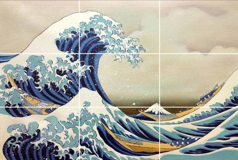
Die große Welle von Kanagawa von Hokusai, veröffentlicht zwischen 1829 und 1833. Die Welle befindet sich im linken und oberen Drittel des Bildausschnitts, während der Berg Fuji im rechten und unteren Drittel des Bildausschnitts zu sehen ist. Ihr Blick wird wahrscheinlich zuerst auf die Welle fallen, sie dominiert das Bild. Dies ist Ihr erster Blickpunkt. Ihre geschwungene Form bestimmt die Blickrichtung.
Hokusai beherrschte diese Regel in seinen Kunstwerken so perfekt und wunderbar.
Die Schnittpunkte werden zu visuellen Brennpunkten und lenken die Aufmerksamkeit des Betrachters.
Die Platzierung von Schlüsselelementen, wie beispielsweise den Augen einer Person oder eines wichtigen Objekts, an diesen Schnittpunkten erzeugt eine starke visuelle Wirkung. Diese strategische Platzierung vermeidet eine statische und zentrierte Komposition und sorgt für ein dynamischeres und ansprechenderes Seherlebnis. Die Schnittpunkte dienen als Ankerpunkte, die den Betrachter in das Kunstwerk hineinziehen und zu seiner Ausgewogenheit und ästhetischen Wirkung beitragen. Experimentieren Sie mit der Platzierung wichtiger Elemente an diesen Schnittpunkten, um eine bestimmte persönliche oder emotionale Stimmung zu vermitteln.

Die Drittelregel ist eine kreative Methode, den Negativraum zu nutzen. Damit sind die leeren oder unbesetzten Bereiche gemeint, die das Hauptmotiv oder die Hauptmotive umgeben.
Es ist der Raum, der um und zwischen den primären Objekten eines Bildes existiert. Obwohl der Negativraum auf den ersten Blick „leer“ erscheinen mag, spielt er eine entscheidende Rolle bei der Definition und Hervorhebung des Hauptmotivs und trägt zur Gesamtbalance und Komposition des Kunstwerks bei.
Der effektive Einsatz des Negativraums kann ein Gefühl von Harmonie erzeugen, die Aufmerksamkeit auf das Motiv lenken und einen Freiraum schaffen, der die visuellen Elemente ergänzt. Künstler nutzen den Negativraum oft bewusst, um den Blick des Betrachters zu lenken, Emotionen hervorzurufen und ihren Kompositionen eine gewisse Schlichtheit oder Eleganz zu verleihen. Das Verständnis des Zusammenspiels von positivem und negativem Raum ist unerlässlich für die Schaffung visuell ansprechender und ausgewogener Kunstwerke.
2. Goldener Schnitt
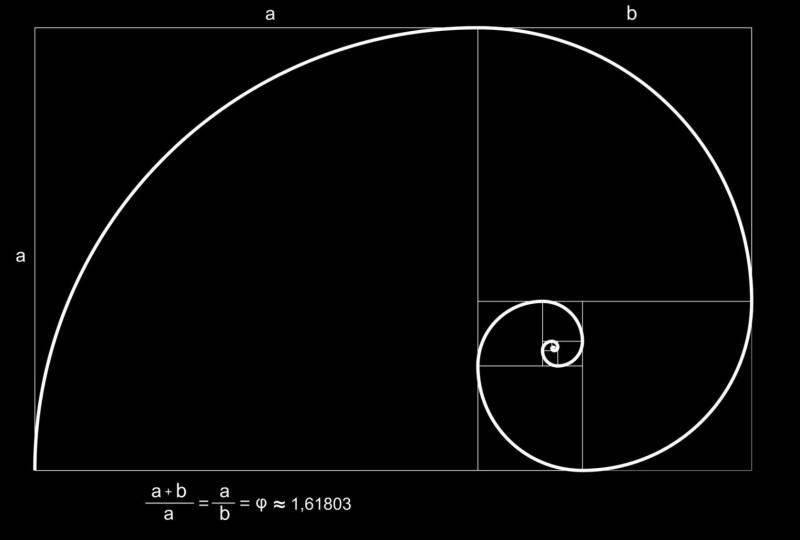
Der Goldene Schnitt, oft mit dem griechischen Buchstaben Phi (φ) bezeichnet, ist ein mathematisches Konzept, das ein bestimmtes Verhältnis in Natur, Kunst und Design beschreibt.
In der bildenden Kunst und im Design wird der Goldene Schnitt häufig angewendet, um ästhetisch ansprechende und harmonische Kompositionen zu schaffen. Das Verhältnis ist durch folgende Beziehung charakterisiert: a/b = (a+b)/a, wobei „a“ der größere und „b“ der kleinere Teil des Ganzen ist.
Angewendet auf ein Rechteck, besagt der Goldene Schnitt, dass das Verhältnis der längeren zur kürzeren Seite dem Verhältnis des gesamten Rechtecks zur längeren Seite entspricht. Dieses Verhältnis soll eine optisch ansprechende und ausgewogene Komposition erzeugen.
Der Goldene Schnitt findet sich auch in verschiedenen Naturphänomenen wieder, wie etwa in der Anordnung von Blättern, dem spiralförmigen Muster von Muscheln und den Proportionen des menschlichen Gesichts. Viele Künstler und Designer nutzen den Goldenen Schnitt bewusst oder unbewusst, um ästhetisch ansprechende Kompositionen zu schaffen.
Hier ist eine allgemeine Anleitung zur Anwendung des Goldenen Schnitts:
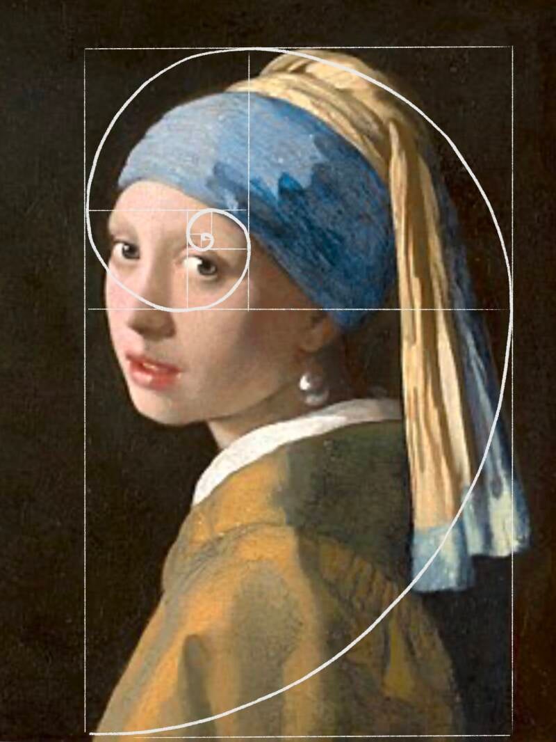
Jan Vermeer: The Girl with the pearl earing
1. Komposition und Aufteilung:
Teilen Sie Ihre Leinwand oder Ihren Gestaltungsbereich nach dem Goldenen Schnitt auf. Erstellen Sie Abschnitte basierend auf diesem Verhältnis und betonen Sie dabei die größeren und kleineren Proportionen.
2. Blickpunkte:
Platzieren Sie Schlüsselelemente oder Blickpunkte an den Schnittpunkten oder entlang der durch die Teilung entstandenen Linien. Diese Punkte ziehen die Aufmerksamkeit des Betrachters auf sich und tragen zu einer harmonischen Komposition bei.
3. Spiralen und Kreise:
Der Goldene Schnitt wird auch mit logarithmischen Spiralen und Fibonacci-Folgen in Verbindung gebracht. Integrieren Sie diese Spiralen oder Kreise, die auf dem Goldenen Schnitt basieren, um den Kompositionsfluss zu lenken.
4. Skalieren und Größenänderung:
Verwenden Sie den Goldenen Schnitt, um die Proportionen beim Skalieren oder Ändern der Größe von Elementen in Ihrem Design zu bestimmen. Die Einhaltung dieser Verhältnisse trägt zu einem optisch ansprechenderen Ergebnis bei.
5. Natürliche Formen:
Beobachten Sie, wie der Goldene Schnitt in der Natur vorkommt, beispielsweise in der Anordnung von Blättern oder dem spiralförmigen Muster von Muscheln. Lassen Sie sich von diesen organischen Vorkommen für Ihr Design inspirieren.

Der Goldene Schnitt kann zwar eine wertvolle Richtlinie sein, doch ist er keine starre Regel, sondern vielmehr ein Werkzeug zur Gestaltung ästhetisch ansprechender Kompositionen. Experimentierfreude und Intuition spielen ebenfalls eine entscheidende Rolle für wirkungsvolle Designs mithilfe des Goldenen Schnitts.
3. Führungslinien
Führungslinien sind visuelle Elemente in einem Bild, die den Blick des Betrachters auf natürliche oder bewusste Weise zu einem bestimmten Fokuspunkt oder einem interessanten Bereich lenken. Diese Linien können real sein, wie Straßen, Wege oder architektonische Merkmale, oder angedeutet, indem sie durch die Anordnung von Elementen, Mustern oder Formen innerhalb der Komposition entstehen.
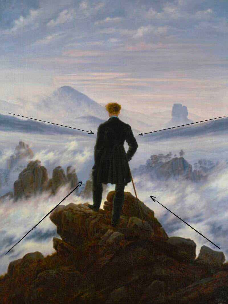
Ein hervorragendes Beispiel für perfekt durchdachte und präzise Linienführung ist das Meisterwerk „Der Wanderer über dem Nebelmeer“ von Caspar David Friedrich.
Die Figur steht in der Mitte des Gemäldes, in Gedanken versunken und in sich gekehrt. Man sieht sie von hinten; der Betrachter blickt in dieselbe Richtung wie die Figur und dient ihr als Identifikationsfigur. Es ist nicht möglich, Rückschlüsse auf den emotionalen Zustand oder die Bedeutung des Gesichtsausdrucks zu ziehen, was dem Bild eine mystische Note verleiht.
Ein massiver Felsen erhebt sich unter dem Wanderer und nimmt zwei Drittel des Bildes ein. Der dunkle Felsen bildet einen starken Kontrast zum hellen Hintergrund und lenkt den Blick des Betrachters sanft nach oben zur Bildmitte.
Im Hintergrund ist eine etwas hellere Bergkette zu erkennen, die zum Wanderer führt.
Dieses Gemälde ist ein eindrucksvolles Beispiel für eine Linienführung, die sich nicht auf den ersten Blick erschließt.
Führende Linien weisen eine klare Richtung und lenken den Blick des Betrachters durch das Bild, oft hin zum Hauptmotiv oder einem Schlüsselelement (wie beispielsweise in „Der Wanderer über dem Nebelmeer“). Sie tragen zur Tiefenwirkung und Perspektive der Komposition bei und schaffen so eine visuelle Reise für den Betrachter. Führende Linien können verschiedene Formen annehmen, darunter gerade Linien, Kurven, Diagonalen, konvergierende Linien oder sogar S-Kurven, die der Komposition Dynamik und Interesse verleihen. Oft verbinden diese Linien verschiedene Bildteile und erzeugen so visuelle Einheit und Kohärenz.
Fotografen, Künstler und Designer setzen führende Linien gezielt ein, um die visuelle Wirkung ihrer Werke zu verstärken und ein Gefühl von Bewegung, Tiefe und Erzählung innerhalb des Bildausschnitts zu erzeugen. Der bewusste Einsatz führender Linien kann die Komposition und die visuelle Gesamtwirkung eines Bildes deutlich verbessern.

4. Balance
Ausgewogenheit in der Bildkomposition bezeichnet die Verteilung visueller Elemente innerhalb eines Bildausschnitts, um ein Gefühl von Gleichgewicht und Harmonie zu erzeugen. Die Erreichung von Ausgewogenheit ist essenziell für ein visuell ansprechendes und gut komponiertes Bild.
Symmetrische Balance:
Bei einer symmetrischen Balance sind die visuellen Elemente gleichmäßig auf beiden Seiten einer zentralen Achse oder eines zentralen Punktes verteilt. Dies erzeugt ein Gefühl von Stabilität und Ordnung und wird oft mit Formalität und klassischer Ästhetik assoziiert. Gängige Beispiele sind Spiegelungen im Wasser, architektonische Symmetrie oder im Bildausschnitt zentrierte Motive.
Asymmetrische Balance:
Asymmetrische Balance bedeutet, visuelle Elemente ungleichmäßig zu verteilen, aber dennoch durch andere Mittel wie Farbe, Größe oder Kontrast ein Gefühl der Ausgewogenheit zu erzeugen. Sie wirkt dynamischer und ungezwungener und ermöglicht Kreativität und Flexibilität in der Komposition. Ein gängiges Beispiel ist ein kleineres, visuell intensives Element, das ein größeres, weniger intensives Element ausgleicht.


Tipps für eine ausgewogene Bildkomposition:
Visuelles Gewicht beachten:
Elemente mit höherem visuellen Gewicht, wie leuchtende Farben oder größere Objekte, gleichen weniger gewichtige Elemente aus.
Negativen Raum nutzen:
Die leeren Bereiche im Bildausschnitt (negativer Raum) tragen zur Ausgewogenheit bei und lenken die Aufmerksamkeit auf das Hauptmotiv.
Mit der Platzierung experimentieren:
Testen Sie verschiedene Anordnungen der Elemente im Bildausschnitt, um eine visuell ansprechende Balance zu finden.
Auf Farben achten:
Ausgewogenheit hängt nicht nur von der Platzierung der Elemente ab, sondern auch von der Verteilung der Farben und Töne innerhalb der Komposition.
Durch die Ausgewogenheit der visuellen Elemente in der Bildkomposition wird die ästhetische Wirkung und die Effektivität des Bildes insgesamt gesteigert, indem der Blick des Betrachters durch ein gut organisiertes und angenehmes visuelles Erlebnis geführt wird.
5. Einfachheit
Die Überschrift verrät bereits viel über den Inhalt des folgenden Textes:
Eine einfache und wirkungsvolle Bildkomposition zu gestalten, ist eine Kunst für sich. Oft neigen wir dazu, Dinge zu überladen und den Wert und die Wirkung von Einfachheit zu unterschätzen. Einfachheit in der Bildkomposition bedeutet, visuelle Elemente innerhalb eines Bildausschnitts bewusst zu minimieren, um ein klares, übersichtliches und fokussiertes Bild zu schaffen.
Hier einige Tipps für eine schlichte Bildkomposition:
Konzentriere dich auf ein einziges Thema:
Wähle ein Hauptthema oder einen Schwerpunkt und stelle ihn in den Mittelpunkt deines Textes. So vermittelst du eine klare und verständliche Botschaft.


Minimalistische Hintergründe:
Wählen Sie einfache und unaufdringliche Hintergründe, die nicht vom Hauptmotiv ablenken. So kann sich der Betrachter auf die wesentlichen Bildelemente konzentrieren.
Negativraum:
Nutzen Sie Negativraum, um Ihrem Motiv Raum zu geben. Dies hilft, das Hauptelement hervorzuheben und trägt zu einem aufgeräumten Eindruck bei.


Beschränken Sie Ihre Farbpalette:
Beschränken Sie sich auf wenige, harmonische Farbtöne. Dies reduziert die visuelle Komplexität und verleiht der Komposition mehr Zusammenhalt.
Klare Linien und Formen:
Verwenden Sie klare Linien und einfache geometrische Formen in Ihrer Komposition. Dies trägt zu einem Gefühl von Ordnung und Schlichtheit bei.


Erzählen Sie eine klare Geschichte:
Achten Sie darauf, dass Ihr Bild eine klare Botschaft oder Geschichte vermittelt. Einfachheit trägt dazu bei, Ihre beabsichtigte Erzählung ohne Missverständnisse zu vermitteln.
Einfachheit bedeutet nicht, auf Kreativität zu verzichten. Es geht darum, die Komposition auf ihre wesentlichen Elemente zu reduzieren und so ein wirkungsvolleres und einprägsameres visuelles Erlebnis zu ermöglichen.
Eine harmonische Bildkomposition kann für Künstler eine große Herausforderung sein. Von der Bildgestaltung über die Balance und die Einfachheit bis hin zu den Blickpunkten trägt jedes Element zu einem ausgewogenen und gelungenen Kunstwerk bei. Gestalten Sie Ihre Komposition bewusst und einladend für den Betrachter. Beachten Sie diese Werkzeuge und Techniken, und Ihr Werk kann herausragend werden. Haben Sie keine Angst vor Fehlern und Misserfolgen; mit jeder Erfahrung schärfen Sie Ihren Blick.
Kommentar hinzufügen
Kommentare