

Dieser Artikel befasst sich mit dem Leben und Werk von Anton Stankowski und beleuchtet seinen künstlerischen Werdegang, seine bahnbrechenden Entwürfe und sein bleibendes Vermächtnis in der Welt der visuellen Kommunikation. Anhand einer detaillierten Untersuchung seiner bedeutendsten Projekte und der Philosophien, die sein Schaffen prägten,
Wer ist Anton Stankowski
Anton Stankowski, eine Koryphäe in der Welt des Grafikdesigns und der visuellen Kommunikation, hat die Kunst und das Design des 20. Jahrhunderts nachhaltig geprägt. Stankowski wurde am 18. Juni 1906 in Gelsenkirchen geboren und blickte auf eine mehrere Jahrzehnte umfassende Karriere zurück, in der er bedeutende Beiträge in den Bereichen Grafikdesign, Fotografie und Malerei leistete. Stankowski war bekannt für seinen innovativen Ansatz in der visuellen Kommunikation. Seine Arbeiten überschritten traditionelle Grenzen und verbanden Kunst mit funktionalem Design, um faszinierende visuelle Erlebnisse zu schaffen.
Stankowskis frühe Ausbildung in Malerei und Fotografie legte einen soliden Grundstein für seine späteren Erfolge. Während seiner Zeit an der Folkwang-Schule in Essen unter der Leitung von Max Burchartz kam er mit den avantgardistischen Bewegungen seiner Zeit in Berührung, die seine künstlerische Vision maßgeblich beeinflussten.

Als er sich tiefer in die Welt des Grafikdesigns vertiefte, entwickelte Stankowski eine einzigartige Bildsprache, die sich durch geometrische Abstraktion und einen ausgeprägten Sinn für Struktur und Ordnung auszeichnet.
Im Laufe seiner produktiven Karriere arbeitete Anton Stankowski an einer Vielzahl unterschiedlicher Projekte, von Firmenlogos und Plakaten bis hin zu Buchumschlägen und Briefmarken. Zu seinen bekanntesten Werken zählen die visuelle Identität der Deutschen Bank und seine Beiträge zum Internationalen Typografischen Stil. Stankowskis Fähigkeit, komplexe Ideen in einfache, aber ausdrucksstarke visuelle Formen zu übertragen, machte ihn zu einem Pionier auf diesem Gebiet und inspirierte Generationen von Designern und Künstlern.

A. Stankowski: Drahtwerke Biel
Auswirkungen und Absichten von Stankowskis Werken
Anton Stankowski war nicht nur ein meisterhafter Designer, sondern auch ein Visionär, der stets die Wirkung seiner Werke im Blick hatte. Seine Entwürfe zeichnen sich durch klare Linien, geometrische Formen und eine reduzierte Farbpalette aus, wodurch eine präzise und ausdrucksstarke Bildsprache entsteht. Durch diese formale Strenge gelang es Stankowski, komplexe Botschaften auf eine Weise zu vermitteln, die sowohl ästhetisch ansprechend als auch leicht verständlich war.
Stankowski wollte mit seinen Entwürfen eine unmittelbare und nachhaltige Wirkung erzielen. Er wollte die Essenz der Informationen auf ihren Kern reduzieren und so eine klare und unverwechselbare Identität schaffen. Ein Paradebeispiel dafür ist das Logo der Deutschen Bank, das aus einem geneigten Quadrat mit einer diagonalen Linie besteht. Dieses einfache, aber wirkungsvolle Design symbolisiert Stabilität und Wachstum und ist zu einem ikonischen Markenzeichen geworden, das bis heute Bestand hat.

A. Stankowski: Logo Deutsche Bank
Ein weiteres bemerkenswertes Werk ist Stankowskis Beitrag zum Internationalen Typografischen Stil, auch bekannt als Schweizer Design. Dieser Stil, der sich durch Rationalität und Funktionalität auszeichnet, hatte einen bedeutenden Einfluss auf Stankowskis Arbeit. Seine Entwürfe in diesem Zusammenhang zeichnen sich durch strukturierte Klarheit und den rationalen Einsatz von Typografie und Raum aus, was eine klare und effektive Kommunikation ermöglicht.
Stankowskis Fähigkeit, Emotionen und Ideen durch geometrische Abstraktionen zu vermitteln, zeigt sich auch in seinen Plakaten und Drucken. Er verwendete Farben und Formen, um dynamische Kompositionen zu schaffen, die die Aufmerksamkeit des Betrachters fesseln und gleichzeitig zu einer tieferen intellektuellen Auseinandersetzung einladen. Diese Arbeiten spiegeln seine Überzeugung wider, dass gutes Design nicht nur funktional sein sollte, sondern auch einen ästhetischen und emotionalen Wert bieten muss.
Berlin-Layout-Analyse mit Gestaltprinzipien
Um die Brillanz von Anton Stankowskis „Berlin Layout“ und dessen Einfluss auf die visuelle Kommunikation vollends würdigen zu können, ist es unerlässlich, die zugrunde liegenden psychologischen Theorien zu verstehen, die seinen Designansatz prägen.
Eines der einflussreichsten Konzepte in dieser Hinsicht sind die Gestaltprinzipien der Wahrnehmung.
Lesen Sie hier mehr darüber:

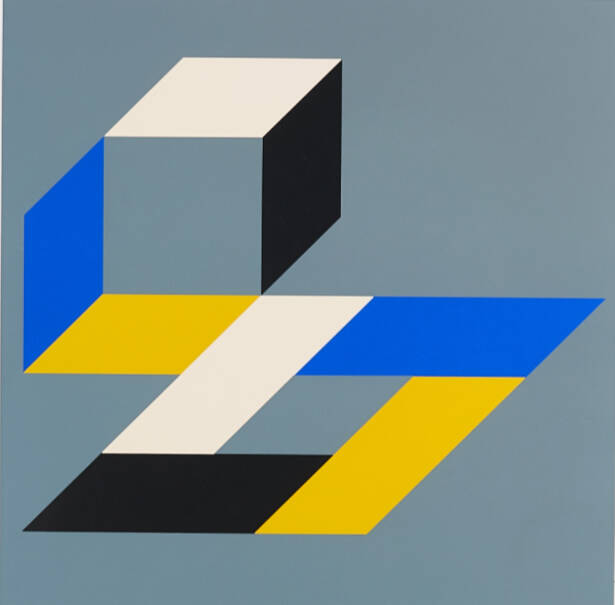
Berlin Layout (1968):
This is one of his notable graphic works, showcasing his mastery of geometric abstraction and visual rhythm
1. Prinzip von Figur und Hintergrund
Das Prinzip von Figur und Hintergrund besagt, dass wir Bilder tendenziell in Vordergrund und Hintergrund unterteilen. Im „Berlin Layout” nutzt Stankowski Kontraste effektiv, um die geometrischen Hauptformen (Figur) vom Hintergrund abzuheben. Durch diese klare Unterscheidung kann sich der Betrachter auf die primären visuellen Elemente konzentrieren, die sich deutlich vom Hintergrund abheben.
2. Prinzip der Ähnlichkeit
Das Prinzip der Ähnlichkeit besagt, dass Objekte, die visuelle Merkmale wie Form, Größe, Farbe oder Textur gemeinsam haben, als miteinander verbunden oder zusammengehörig wahrgenommen werden. Stankowski verwendet ähnliche geometrische Formen und Farben, um ein Gefühl der Einheit und Kohärenz innerhalb der Komposition zu erzeugen. Die wiederholte Verwendung bestimmter Formen, wie Rechtecke und Linien, gruppiert diese Elemente im Kopf des Betrachters und verstärkt so die Gesamtstruktur des Designs.
3. Prinzip der Nähe
Nach dem Prinzip der Nähe werden Objekte, die nahe beieinander liegen, tendenziell als Gruppe wahrgenommen. Im „Berlin Layout” platziert Stankowski verwandte Formen und Linien in unmittelbarer Nähe zueinander, sodass der Betrachter sie als Teil eines zusammenhängenden Ganzen wahrnimmt. Diese Gruppierung trägt dazu bei, ein strukturiertes und organisiertes Layout zu schaffen, das es dem Betrachter erleichtert, das Design als einheitliches Ganzes zu interpretieren.
4. Prinzip der Kontinuität
Das Prinzip der Kontinuität besagt, dass Elemente, die auf einer Linie oder Kurve angeordnet sind, als stärker miteinander verbunden wahrgenommen werden als Elemente, die nicht auf dieser Linie oder Kurve liegen. Stankowski nutzt dieses Prinzip, indem er Formen und Linien so ausrichtet, dass das Auge des Betrachters sanft über die Komposition geführt wird. Der kontinuierliche Fluss von Linien und geometrischen Formen schafft einen visuellen Pfad, dem der Betrachter ganz natürlich folgt, wodurch die allgemeine Harmonie und Bewegung innerhalb des Layouts verstärkt wird.
5. Prinzip der Geschlossenheit
Das Prinzip der Geschlossenheit bezieht sich auf unsere Tendenz, unvollständige Formen als vollständig wahrzunehmen. Im „Berlin Layout” verwendet Stankowski Teilformen und suggeriert Formen, ohne sie vollständig zu umreißen. Der Betrachter füllt die Lücken in seinem Kopf aus, vervollständigt die Formen und trägt so zum Gesamtverständnis des Designs bei. Diese Technik sorgt für zusätzliche Spannung, da die Betrachter aktiv an der Interpretation der visuellen Elemente beteiligt sind.
6. Prinzip der Symmetrie und Ordnung
Dieses Prinzip besagt, dass symmetrische Elemente als Teil derselben Gruppe wahrgenommen werden und dass Ordnung die visuelle Stabilität erhöht. Stankowskis Design zeichnet sich häufig durch Symmetrie und eine gut geordnete Anordnung geometrischer Formen aus. Dadurch entsteht eine ausgewogene und harmonische Komposition, die das Design ästhetisch ansprechend und leichter zu verarbeiten macht.
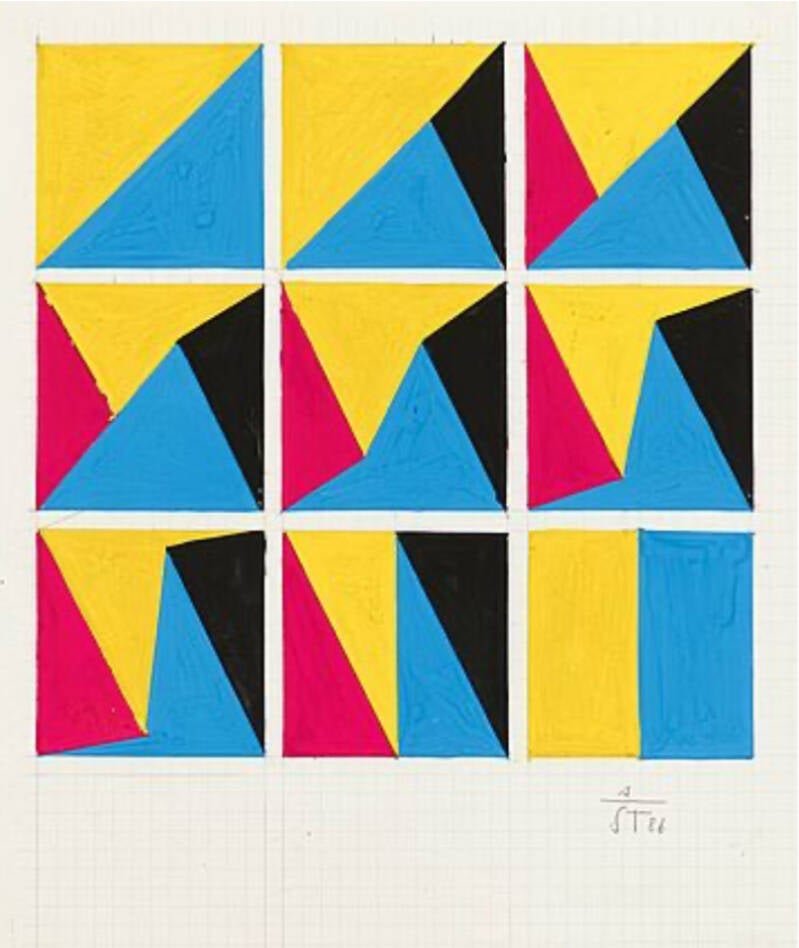
A. Stankowski: Untitled
Geometrische Formen: Stankowski verwendet eine Vielzahl geometrischer Formen wie Quadrate, Rechtecke und Linien, die systematisch angeordnet sind, um ein Gefühl von Ordnung und Vorhersehbarkeit zu erzeugen. Diese Anordnung folgt den Prinzipien der Ähnlichkeit und Nähe.
Farbverwendung: Eine begrenzte Farbpalette betont die Einfachheit und lenkt den Fokus. Ähnliche Farben werden nach dem Prinzip der Ähnlichkeit gruppiert.
Farbgebung: Die begrenzte Farbpalette betont die Einfachheit und lenkt den Fokus. Ähnliche Farben werden nach dem Prinzip der Ähnlichkeit gruppiert.
Dynamische Komposition: Trotz des strukturierten Ansatzes hat die Anordnung der Formen eine dynamische Qualität, die dem Prinzip der Kontinuität folgt und einen visuellen Fluss erzeugt.
Anton Stankowskis „Berlin Layout“ ist eine meisterhafte Anwendung der Gestaltprinzipien. Durch den strategischen Einsatz von Figur-Grund-Kontrast, Ähnlichkeit, Nähe, Kontinuität, Geschlossenheit und Symmetrie schafft Stankowski ein zusammenhängendes, ansprechendes und visuell harmonisches Design. Dieser Ansatz unterstreicht nicht nur sein tiefes Verständnis der visuellen Wahrnehmung, sondern demonstriert auch seine Fähigkeit, komplexe Ideen durch einfache, aber wirkungsvolle geometrische Abstraktion zu vermitteln.
Stankowskis Designphilosophie
Anton Stankowskis Designphilosophie basierte auf der Überzeugung, dass visuelle Kommunikation zugleich funktional und ästhetisch ansprechend sein sollte. Er verstand Design als eine universelle Sprache, die komplexe Inhalte in klare und fesselnde Formen übersetzen kann. Sein Ansatz war von der geometrischen Abstraktion geprägt, bei der Einfachheit und Klarheit im Mittelpunkt standen.
Stankowski war überzeugt, dass gutes Design über bloße Dekoration hinausgeht und die Fähigkeit besitzt, tiefere Botschaften zu vermitteln. Er legte großen Wert auf Ordnung, Struktur und innere Logik und strebte danach, Arbeiten zu schaffen, die nicht nur visuell prägnant, sondern auch intuitiv verständlich sind. Seine Haltung wurde stark vom Bauhaus und vom International Typographic Style beeinflusst, die beide Funktionalität und Reduktion auf das Wesentliche betonten.
Ein grundlegendes Element von Stankowskis Philosophie war der Einsatz geometrischer Formen. Er betrachtete sie als Bausteine einer visuellen Sprache, die Bedeutung vermitteln können, ohne auf komplexe Bildwelten zurückzugreifen. Diese Überzeugung zeigt sich deutlich in seinen ikonischen Arbeiten, etwa im Logo der Deutschen Bank, in dem eine einfache diagonale Linie innerhalb eines Quadrats Konzepte wie Stabilität und Wachstum ausdrückt.
Stankowskis Streben nach Klarheit und Funktionalität lässt sich vielleicht am besten mit seinen eigenen Worten zusammenfassen:
„Design sollte weder Dinge noch Menschen beherrschen. Es sollte den Menschen helfen. Das ist seine Aufgabe.“
Diese Aussage verdeutlicht Stankowskis Anspruch, Design nicht nur als ästhetisches Mittel zu begreifen, sondern als Werkzeug, das einen funktionalen Zweck erfüllt. Sein Ziel war es, das Nutzererlebnis zu verbessern und Verständnis zu fördern.
Darüber hinaus zeigt Stankowskis Auseinandersetzung mit den Gestaltprinzipien seine Überzeugung von den psychologischen Dimensionen des Designs. Er erkannte, dass das menschliche Gehirn von Natur aus nach Mustern und Ordnung sucht, und nutzte dieses Wissen, um Gestaltungen zu schaffen, die auf einer tieferen kognitiven Ebene ansprechen. Durch den gezielten Einsatz von Prinzipien wie Figur-Grund-Beziehung, Ähnlichkeit und Kontinuität entwickelte er Kompositionen, die sowohl visuell ansprechend als auch geistig stimulierend waren.
Im Kern war Anton Stankowskis Designphilosophie von einer Verbindung aus künstlerischer Kreativität und wissenschaftlicher Präzision geprägt. Er verstand Design als Kommunikationsmittel, das die Kluft zwischen Form und Funktion sowie zwischen Kunst und praktischer Anwendung überbrücken kann. Sein Werk bleibt ein eindrucksvolles Zeugnis für die nachhaltige Wirkung durchdachten, präzise ausgeführten Designs.
Kommentar hinzufügen
Kommentare