
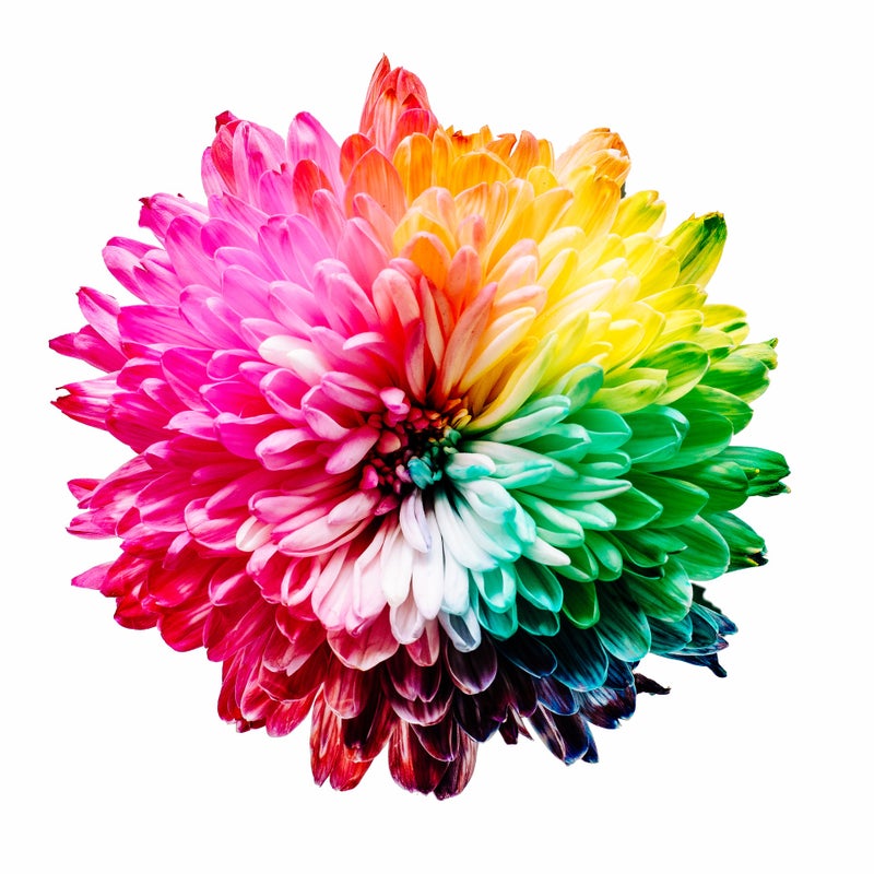
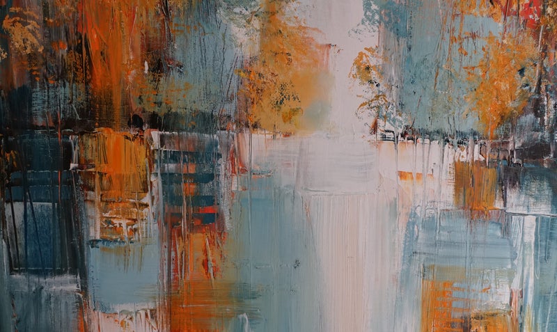
Die Reise durch die Welt der Farbtheorie ist für Künstler wie die Entdeckung eines Schatzes. Das Verständnis der Farbharmonie ist für jeden Künstler der Schlüssel zur Schaffung eines aussagekräftigen Kunstwerks. Ihr Kunstwerk steht und fällt mit der Farbwahl Ihrer Palette.
Lassen Sie uns die Grundlagen erforschen und die Kunstfertigkeit des Spektrums entdecken.

Exploring the Fundamentals of Color Theory
Farbe, ein kraftvolles und eindrucksvolles Element in Kunst und Design, prägt unsere Wahrnehmung und Emotionen entscheidend. Das Verständnis der Grundlagen der Farbtheorie ist für jeden unerlässlich, der visuell ansprechende und harmonische Kompositionen schaffen möchte.
Einführung in den Farbkreis
Das Herzstück der Farbtheorie ist der Farbkreis. Dieses kreisförmige Diagramm ordnet Farben systematisch und hilft Künstlern und Designern, ihre Beziehungen zu verstehen. In der modernen Farbtheorie berücksichtigen einige Modelle differenziertere Auffassungen der Farbmischung.
Farbtheorien haben sich weiterentwickelt. Johannes Ittens Modell ist zwar einflussreich, doch es gibt alternative und ausgereiftere Theorien, wie beispielsweise die Farbtheorie von Harald Küppers.
In der modernen Farbtheorie berücksichtigen einige Modelle differenziertere Auffassungen der Farbmischung. Die traditionellen Primärfarben Rot, Blau und Gelb bilden die Komplexität der Farbmischung in bestimmten Kontexten möglicherweise nicht perfekt ab.
Ein modernes Modell ist das im Druck verwendete CMYK-Farbmodell, bei dem Cyan, Magenta, Gelb und Schwarz die Primärfarben sind. Im digitalen Design ist das RGB-Modell (Rot, Grün, Blau) vorherrschend.
Die Farbtheorie kann in verschiedenen Bereichen wie Kunst, Design und Wissenschaft variieren. Es ist sinnvoll, verschiedene Modelle zu erkunden und dasjenige auszuwählen, das Ihren spezifischen Anforderungen oder Ihrem Kontext am besten entspricht.
Farblehre von Harald Küppers
Küppers Farbenlehre basiert auf 8 Grundfarben, zu denen auch Schwarz und Weiß gehören. Um alle möglichen Mischfarben darzustellen, entwarf er den Rhomboeder-Farbraum, eine dreidimensionale Darstellung aller Primär- und Mischfarben.

Rhomboeder Color Space
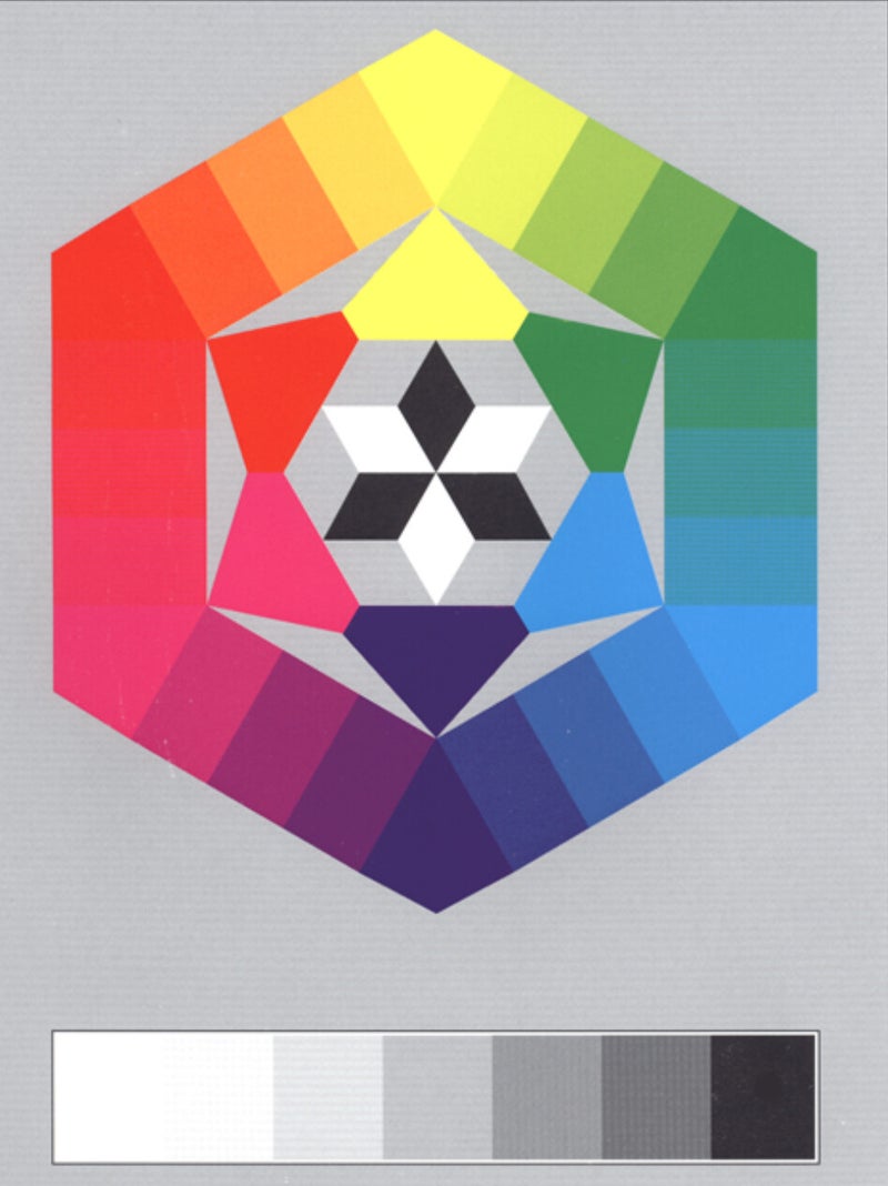
Color Wheel by Harald Küppers
Er unterscheidet zwischen bunten und unbunten Farben. Schwarz und Weiß sind unbunt, Orange, Gelb, Grün, Cyan, Magenta, Violettblau und Orangerot sind bunt. Durch Mischen aller Grundfarben entsteht der rhomboedrische Farbraum. Aus diesen Grundfarben lassen sich theoretisch alle Farben mischen.
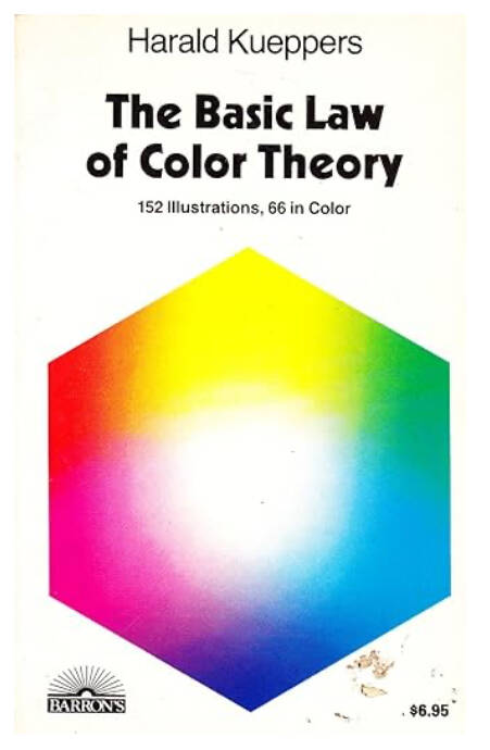
Harald Küppers war einer der größten Kritiker von Ittens Farbenlehre. Er bezeichnete die Primärfarben von Itten (Rot, Gelb, Blau) als Sekundärfarben. Bei praktischen Experimenten mit Ittens Grundfarben (Rot, Blau, Gelb) ist es nicht möglich, ein reines Violett oder ein reines Grün zu mischen. Ebenso ist es unmöglich, durch Mischen dieser drei Farben Schwarz zu erzeugen. Ittens Ansichten sind überholt. Viele Schulen unterschiedlichen Niveaus unterrichten tatsächlich nach dieser Methode. Wenn Sie tiefer in die Farbenlehre von Harald Küppers eintauchen möchten, empfehle ich seine Bücher.
Doch es wäre falsch anzunehmen, Johannes Ittens Entdeckungen seien nicht wertvoll gewesen. Das Gegenteil ist der Fall. Seine Erkenntnisse über Farbkontraste sind absolut bedeutsam. Seine Arbeit ist grundlegend für das Verständnis der Wechselwirkung von Farben und ihrer effektiven Verwendung im Design.
Johannes Itten war eine herausragende Persönlichkeit der Bauhaus-Bewegung und ist vor allem für sein Buch „Die Kunst der Farbe“ bekannt. Darin beschreibt Itten verschiedene Prinzipien der Farbharmonie und des Farbkontrasts und bietet einen systematischen Ansatz für den effektiven Einsatz von Farbe. Er identifizierte sieben Arten von Farbkontrasten, die jeweils unterschiedliche visuelle Effekte und emotionale Reaktionen hervorrufen.
7 Kontrasttypen von Johannes Itten
1. Farbkontrast
Dieser Kontrast entsteht durch die Gegenüberstellung verschiedener Farbtöne. Je stärker sich die Farbtöne voneinander unterscheiden, desto größer ist der Kontrast.

2. Hell-Dunkel-Kontrast
Hierbei geht es um den Kontrast zwischen hellen und dunklen Farben. Er ist einer der grundlegendsten und wirkungsvollsten Kontraste.
3. Kalt-Warm-Kontrast
Dieser Kontrast entsteht zwischen kalten (Blau, Grün) und warmen (Rot, Gelb) Farben.
4. Komplementärkontrast
Dieser Kontrast entsteht durch Farben, die sich im Farbkreis gegenüberliegen (z. B. Rot und Grün, Blau und Orange).

5. Simultankontrast
Dieses Phänomen tritt auf, wenn eine Farbe von den umgebenden Farben beeinflusst wird. Es beschreibt die Art und Weise, wie Farben interagieren und sich gegenseitig beeinflussen.
6. Sättigungskontrast
Hierbei geht es um den Kontrast zwischen reinen, intensiven Farben und matten, verdünnten Farben.

7. Ausdehnungskontrast (Proportion)
Bei diesem Kontrast geht es um die relativen Flächen zweier oder mehrerer Farbfelder. Dabei geht es darum, die Farben hinsichtlich ihres Flächenbedarfs auszugleichen.

Color Harmony
Farbharmonie ist ein faszinierender Aspekt der Farbtheorie, bei dem es darum geht, ästhetisch ansprechende Farbkombinationen zu schaffen.
Monochrome Harmonie
Monochrome Farbharmonie basierend auf einer einzigen Farbe mit Variationen in Helligkeit, Wert und Sättigung. Sie kann einen anspruchsvollen und einheitlichen Look erzeugen. Die Einfachheit der Arbeit mit einer einzigen Farbe kann ein Gefühl der Einheit vermitteln. Dieser unkomplizierte Ansatz ist auch für Design- und Kunstanfänger zugänglich. Die Wahl verschiedener Variationen derselben Farbe reduziert die Komplexität der Farbauswahl. Variationen in Helligkeit und Dunkelheit des gewählten Farbtons erzeugen visuelles Interesse und Tiefe in monochromen Kompositionen. Künstler verwenden oft monochrome Paletten, um bestimmte Stimmungen oder Emotionen hervorzurufen. Die Verwendung einer einzigen Farbe kann ein kraftvolles und fokussiertes künstlerisches Statement erzeugen.
Harmonische Farbschemata
Harmonische Farbschemata zielen darauf ab, optisch ansprechende und ausgewogene Farbkombinationen zu schaffen. Harmonie erfordert das Verständnis von Farbbeziehungen und die Auswahl gut harmonierender Farbtöne.
Berücksichtigen Sie bei der Gestaltung harmonischer Farbschemata Faktoren wie Farbintensität, Helligkeit und Farbtiefe sowie Proportionen. Das Verständnis der emotionalen und psychologischen Assoziationen von Farben innerhalb eines gewählten Schemas trägt zum Gesamterfolg einer harmonischen Komposition bei. Farbschemata sind strukturierte Farbanordnungen, die einen optisch ansprechenden und harmonischen Effekt erzeugen.
Erfahren Sie mehr über die Gestaltung ansprechender Farbkombinationen. Verschiedene Farbschemata, wie analoge, komplementäre und triadische, tragen zur Farbharmonie in Kunstwerken oder Designs bei. Das Verständnis der grundlegenden Farbschemata bildet die Grundlage für die Gestaltung optisch ansprechender Designs oder Kunstwerke. Das Experimentieren mit den Schemata und das Beobachten ihrer Wirkung kann Ihnen helfen, ein intuitives Gespür für Farbkombinationen zu entwickeln.

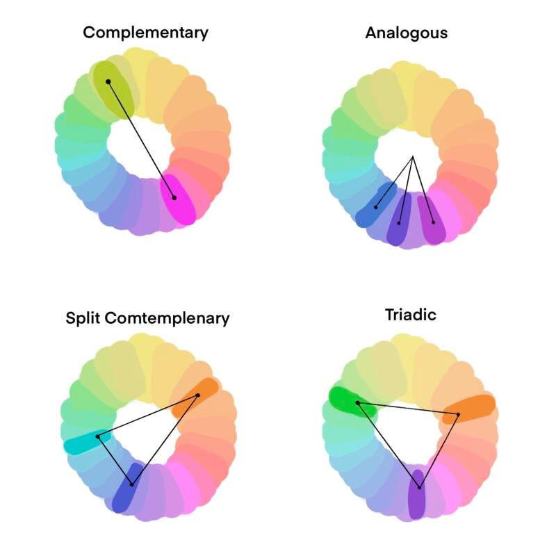
Analog:
Verwendet Farben, die im Farbkreis nebeneinander liegen.
Es vermittelt ein Gefühl der Einheit und kommt häufig in der Natur vor.
Komplementär:
Verwendet Farben, die im Farbkreis gegenüberliegen.
Sie bieten hohen Kontrast und Leuchtkraft, können aber optisch intensiv wirken.
Triadisch:
Verwendet drei gleichmäßig im Farbkreis verteilte Farben. Sie sorgen für Ausgewogenheit und Abwechslung.
Geteilt-komplementär:
Verwendet eine Grundfarbe und die beiden benachbarten Farben ihrer Komplementärfarbe. Sie sorgt für einen hohen Kontrast und weniger Spannung als ein direkt komplementäres Schema.
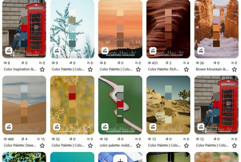
Ich lege auf meinem Pinterest einen Ordner mit verschiedenen harmonischen Farbschemata an. Alle meine Farbinspirationen habe ich hier in einem Ordner gesammelt, was auch hilfreich ist, wenn man selbst nach Inspiration sucht.
Natur als Inspiration
Die Natur ist eine reichhaltige und vielfältige Inspirationsquelle für Farbgestaltungen. Wer die Natur mit aufmerksamen Augen verbringt, findet dort viel Inspiration – nicht nur eine Wohltat für die Seele. Jede Jahreszeit hat ihren eigenen, unverwechselbaren Charakter.
Berücksichtigen Sie bei der Umsetzung der Naturfarben in Ihre Projekte nicht nur die einzelnen Farben, sondern auch ihre Beziehungen und Proportionen. Die Natur besitzt die angeborene Fähigkeit, Farben zu harmonisieren und bietet so endlose Möglichkeiten für die Gestaltung schöner und ausgewogener Farbgestaltungen.
In einem weiteren Artikel von mir vertiefen wir dieses Thema. Lesen Sie hier mehr darüber, warum die Natur unsere Kunst maßgeblich beeinflusst.


Farben mischen
Die Farbtheorie befasst sich mit der Farbmischung, da sie uns hilft zu verstehen, wie verschiedene Farben miteinander interagieren und neue Farben entstehen. Es gibt zwei Hauptmethoden der Farbmischung: additiv und subtraktiv.
Additive Farbmischung:
Bei dieser Methode wird farbiges Licht kombiniert. Die Grundfarben der additiven Farbmischung sind Rot, Grün und Blau (RGB). Werden diese Farben in unterschiedlichen Intensitäten kombiniert, entsteht ein Farbspektrum. Dieses Verfahren wird häufig bei digitalen Anzeigen wie Computermonitoren und Fernsehbildschirmen eingesetzt.
Subtraktive Farbmischung:
Bei dieser Methode werden Farbpigmente oder Tinten kombiniert. Die Grundfarben der subtraktiven Farbmischung sind Cyan, Magenta und Gelb (CMY). Beim Mischen absorbieren oder subtrahieren diese Farben bestimmte Wellenlängen des Lichts und erzeugen so ein Farbspektrum. Die subtraktive Farbmischung wird in der Druck- und Malereibranche eingesetzt.

Das Verständnis der Farbmischung ist für Künstler von entscheidender Bedeutung, da es die gezielte und kontrollierte Erzeugung bestimmter Farbtöne ermöglicht. Es hilft bei der Wahl der richtigen Farbkombination, um die gewünschten Effekte zu erzielen, sei es bei der Gestaltung lebendiger Gemälde, Logos oder präziser Drucke.
Die Farbtheorie untersucht auch Sekundär- und Tertiärfarben, die durch die Mischung von Primär- und Sekundärfarben entstehen. Dieses Wissen ermöglicht ein tieferes Verständnis der Farbbeziehungen und trägt zur Gestaltung harmonischer und optisch ansprechender Kompositionen bei.

Farbspychologie
Untersucht die psychologische und emotionale Wirkung von Farben und wie sie Wahrnehmung und Stimmung beeinflussen können.
Farben haben nicht nur eine ästhetische Wirkung, sondern auch einen tiefgreifenden Einfluss auf menschliche Emotionen, Wahrnehmungen und Verhaltensweisen. Die Farbpsychologie untersucht die komplexen Zusammenhänge zwischen Farben und der menschlichen Psyche. Sie können unsere Gedanken und Gefühle beeinflussen.
Jede Farbe hat eine einzigartige emotionale Resonanz. Warme Farben wie Rot und Gelb rufen oft Gefühle von Energie, Leidenschaft und Wärme hervor, während kühle Farben wie Blau und Grün eher ein Gefühl von Ruhe, Gelassenheit und Gelassenheit erzeugen. Das Verständnis dieser emotionalen Assoziationen ermöglicht es uns Künstlern, Farben strategisch einzusetzen, um bestimmte Stimmungen oder Botschaften zu vermitteln.


Farben werden oft mit symbolischen Bedeutungen assoziiert. Rot kann beispielsweise Liebe, Leidenschaft oder Gefahr symbolisieren. Blau kann Vertrauen, Loyalität oder Traurigkeit repräsentieren. Diese symbolischen Darstellungen tragen zur Wirkung von Farben in der visuellen Kommunikation und im Branding bei.
Farbpsychologie beeinflusst menschliches Verhalten nicht nur durch Emotionen. Restaurants verwenden oft warme Farben wie Rot und Orange, um den Appetit anzuregen, während Krankenhäuser auf beruhigende Blau- und Grüntöne setzen, um eine wohltuende Atmosphäre zu schaffen. Einzelhändler setzen Farben gezielt ein, um Impulskäufe zu fördern oder ein Gefühl von Vertrauen zu vermitteln.
Jeder Mensch hat aufgrund von Erfahrungen, Erinnerungen oder kulturellen Einflüssen persönliche Vorlieben für bestimmte Farben. Diese Vorlieben können Aspekte der Persönlichkeit widerspiegeln und die Wahl von Kleidung, Einrichtung und sogar Karriere beeinflussen.

In Bildungs- und Arbeitsumgebungen kann Farbe Konzentration, Fokus und Produktivität beeinflussen. Studien deuten darauf hin, dass bestimmte Farben die kognitive Leistung steigern und eine förderliche Lern- oder Arbeitsatmosphäre schaffen können.
Die Kunst, Farben harmonisch zu kombinieren, ist ein zentraler Bestandteil der Farbpsychologie. Harmonische Farbschemata, die auf den Prinzipien der Farbtheorie basieren, tragen zu einer ausgewogenen und optisch ansprechenden Umgebung bei. Um Harmonie zu erreichen, muss man Farbkontraste, komplementäre Beziehungen und die visuelle Gesamtwirkung von Farbkombinationen verstehen.
Designer nutzen die Farbpsychologie, um mit ihren Kreationen gewünschte Reaktionen hervorzurufen. Vom Website-Design bis zur Verpackung kann der durchdachte Einsatz von Farben die Nutzerinteraktion, die Markenwahrnehmung und das gesamte Nutzererlebnis beeinflussen.
Zusammenfassend lässt sich sagen, dass die Farbpsychologie das faszinierende Zusammenspiel zwischen Farben und dem menschlichen Geist enthüllt. Von der Beeinflussung unserer Emotionen bis hin zur Gestaltung unseres Verhaltens sind Farben kraftvolle Kommunikatoren, die über die bloße visuelle Ästhetik hinausgehen. Indem wir die Tiefen der Farbpsychologie weiter erforschen, gewinnen wir Einblicke in die komplexe Sprache der Farbtöne, die still, aber effektiv unsere Sinne und Emotionen anspricht.
Farbwahrnehmung
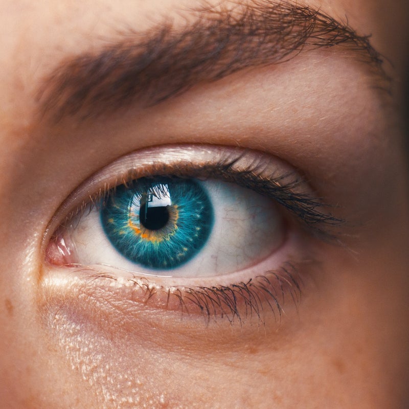
Farbsehen und Farbwahrnehmung sind integrale Aspekte der Art und Weise, wie Menschen die visuelle Welt interpretieren und darauf reagieren.
Color vision is made possible by specialized cells called cones in the retina of the eye. Humans typically have three types of cones, each sensitive to different wavelengths of light.
The human visual system operates on trichromatic vision, meaning it combines signals from the three types of cones to perceive a broad spectrum of colors. The brain processes the information from these cones to create the perception of various hues.
Combining signals from different cones allows the brain to perceive a wide range of colors. For example, the brain interprets signals from both red and green cones as yellow.
Farbenblindheit entsteht durch den Mangel oder das Fehlen eines oder mehrerer Zapfentypen. Die häufigste Form ist die Rot-Grün-Farbenblindheit, bei der Betroffene Schwierigkeiten haben, zwischen roten und grünen Farbtönen zu unterscheiden.
Nach dieser Theorie basiert die Farbwahrnehmung auf drei Paaren entgegengesetzter Farbrezeptoren: Rot-Grün, Blau-Gelb und Schwarz-Weiß. Die Aktivierung einer Farbe eines Paares hemmt die andere und trägt so zu Farbkontrasteffekten bei.
Farbkonstanz ist die Fähigkeit des menschlichen Sehsystems, die gleiche Farbe eines Objekts unter unterschiedlichen Lichtverhältnissen wahrzunehmen. Dieses Phänomen ermöglicht es uns, die Farben von Objekten trotz wechselnder Beleuchtung zu erkennen.
Kulturelle und individuelle Faktoren können die Farbwahrnehmung beeinflussen. Unterschiede in Sprache, kulturellem Hintergrund und persönlichen Erfahrungen können die Art und Weise beeinflussen, wie Menschen Farben interpretieren und beschreiben.
Optische Täuschungen nutzen Aspekte der Farbwahrnehmung und zeigen, wie das Gehirn Farben im Kontext interpretiert. Beispiele sind Farbnachbilder und die Wahrnehmung von Farben, die von umgebenden Farbtönen beeinflusst werden.
Einige Forscher gehen davon aus, dass sich das Farbsehen entwickelt hat, um dem Menschen dabei zu helfen, zwischen reifen und unreifen Früchten zu unterscheiden, Raubtiere oder Beute zu erkennen und sich in der Umgebung effektiv zurechtzufinden.

Das Verständnis von Farbsehen und -wahrnehmung ist im Designbereich von entscheidender Bedeutung. Designer und Künstler nutzen dieses Wissen, um visuell ansprechende und wirkungsvolle Kompositionen zu schaffen und dabei Faktoren wie Kontrast, Harmonie und Lesbarkeit zu berücksichtigen.
Farbsehen und -wahrnehmung umfassen im Wesentlichen komplexe Prozesse, die mit der Erkennung von Lichtwellenlängen durch das Auge beginnen und in der Interpretation dieser Signale durch das Gehirn gipfeln, die zu dem vielfältigen Farbspektrum führt, das wir in unserem täglichen Leben erleben.
Kommentar hinzufügen
Kommentare